

Professionals like @ifeoluwasopeju should be doing this for a novice like me. But since charity should begin at home. I'll launch my review journey by reviewing my own Logo.
I designed that sweet logo this morning, 12.23.20. Can you smell the bias already? Hahaha. Well, allow me take it easy on me. I am just an amateur.
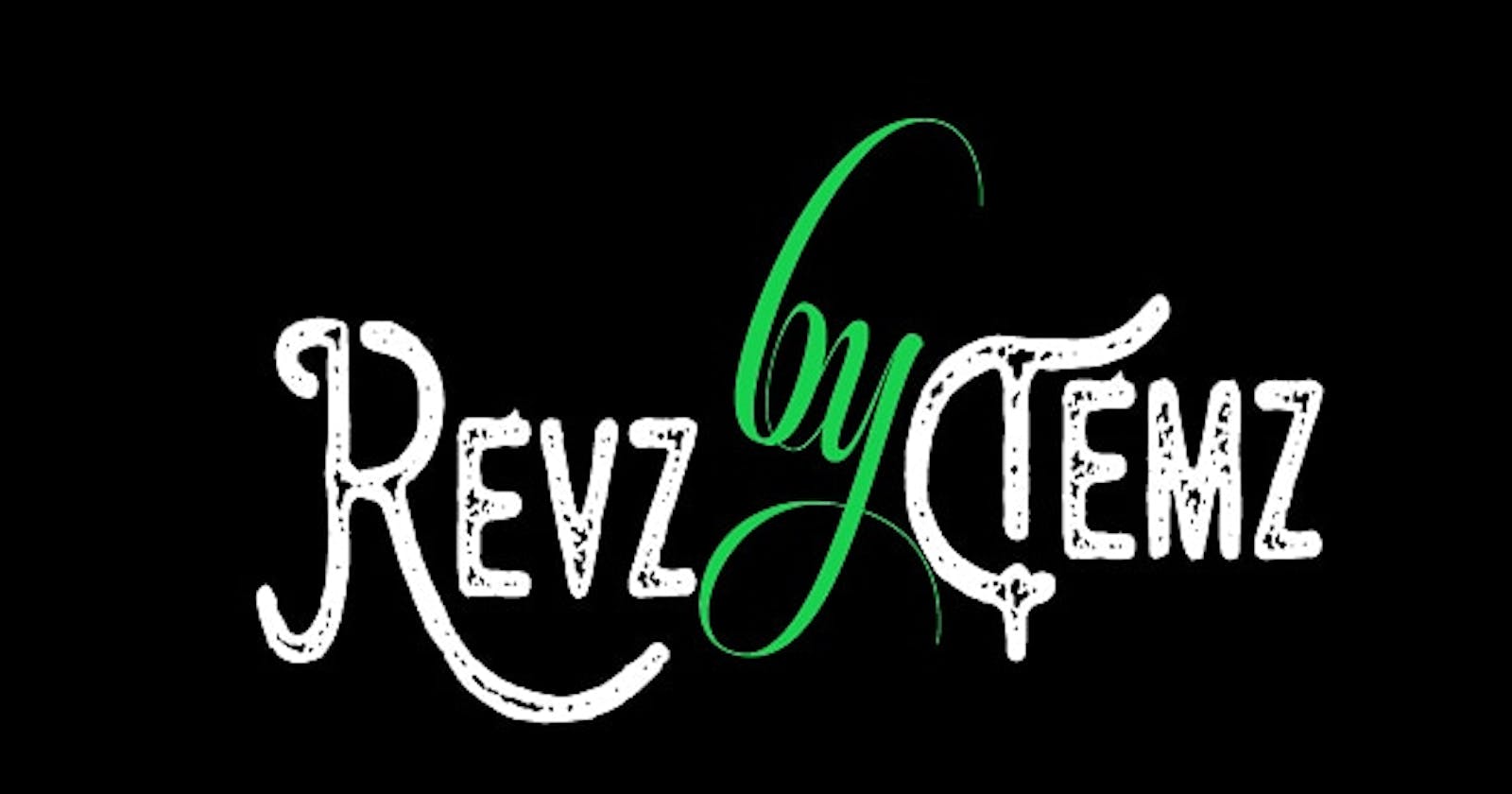
General overview. It obviously lack a professional touch. Something seems missing. First, It's annoyingly blurry. Good logos are crisp, bright, yet easy on the eyes. Then the font could've been more classic considering the purpose. Talking of the font, what's that design on the font? Is that black, white or an adire coloured font? Babe. Logos do better with defined colours so that when it's scaled down, you can still see them easily.
Also, if anybody should see "RevzbyTemz" will they have a clue of what it's about? Or will they be at least curious to find out? Sincerely, I don't know.
But kam dan abeg. The logo is not that bad. If nothing, the choice of colour is great. It's a very simple logo. And I think the choice of font portrays a playful-serious vibe which is exactly my energy. That is to say, my reviews on most things won't be personal. If anything, it'll be candid and aimed towards betterment.
Should it ever offend you, consider these three quotes below and be appeased:
• You know who critics are? The men who have failed in Literature and Art . My colleagues can attest to this.
• A critic is a man who knows the way but can't drive the car . Sometimes. I may not even know the way.
• I know how foolish critics can be, being one myself . Aswear down! Lol.
I said three? Forgive me.
• Unless the bastards (Temi) have the courage to give you unqualified praise, I say ignore them . Just ignore the bastard.
That being said guys. Let's have fun!!!
And please, feel free to drop your guided opinions too.
Temz.